
Extended Data Figure 7. Yield of de novo LGD and missense mutations.
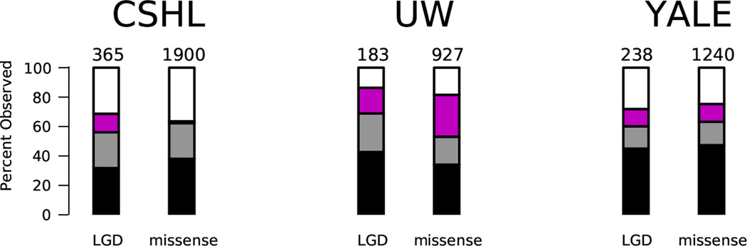
We plot the yield of de novo LGD and missense mutations per sequencing center (designations as in Extended Data Figure 1). In each case we show the number of mutations we expect to see based on the estimated rates per child, indicated by the numbers above the bars. We also show what percentage of the expected number we have observed. Black refers to strong calls in the 40× target, gray refers to strong calls outside of 40× target, and magenta refers to weak (but valid) calls. The white region represents the difference between the expected and observed numbers of variants.