
Fig. 3.
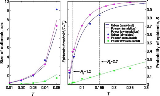
Predicting outbreaks and epidemics. The left graph illustrates the average number of people infected in a small outbreak, 〈s〉, when T is below the epidemic threshold. The right graph illustrates S, the probability that an epidemic occurs when T is above the epidemic threshold. S also equals the expected fraction of the population infected during an epidemic, should one occur. The vertical lines correspond to recent estimates of R0 for SARS pre-intervention (right) and post-intervention (left) (Chowell and Fenimore, 2003a, Chowell and Hyman, 2003b; Lipsitch et al., 2003; Riley et al., 2003). Note that we chose the parameters for the power law and Poisson networks so that for any value of T, all three networks share the same . Simulation values are based on 2571 simulated epidemics, each starting with a unique individual in the network.